A picture is worth a thousand words...
- Well not if the picture slows down your website causing your visitors to bounce. Large image files have a considerable impact on the load time of your pages. Fortunately there are several techniques to optimize your images and successfully reduce the file size without any apparent difference. For images published with continuously posted articles on a web page you might need to rely on scripting for the optimization and most content management systems also has build in compression for image uploads. But for the images that you use for your themes, logos, icons, banners and sliders, that you might have carefully composed, edited and colour graded, should really also be carefully and manually optimized.
Choosing the right format
When publishing images for the web you will of cause have to use a supported format. Images that consist of pixels are called raster images or bitmap images. These images are the most common for digital image files and the supported formats for raster images in all browsers are GIF, PNG(8/24/32) or JPEG. All the formats have their own pros and cons so it is important to analyse your images in order to determine which format is the most optimal. The 3 major issues are:
- How many colours are required?
- Does the image contain soft colour transitions/ gradients or blur?
- Does the image have transparent or semi transparent pixels?
Indexed colour formats (8 bit)
For images with few colours and sharp transitions you can get some very good results with 8 bit formats. 8 bit formats for web are PNG-8 and GIF. These formats can contain 256 colours and two values for alpha (opaque or full transparency). PNG-8 can be saved with lossless compression and will reduce the file size considerably. For this reason PNG-8 files are usually smaller than GIF. The only reason to choose GIF over PNG-8 is if your image is animated.
True colour formats (24 bit)
For images with more than 256 colours and with smooth colour transitions, you must use true colour formats like JPEG or PNG-24/32. These formats has 3 channels for colour values: Red, Green and Blue. Each channel has 256 possible values and the channels can be mixed which allows for millions of possible colours. The 3 channels adds up to 24 bit which makes an uncompressed true colour image 3 times larger than an 8 bit image. JPEG is designed to compress photographs and produces very good results with very small file sizes. This compression is not lossless and will generate visible artefacts if you compress the images too much. PNG-24/32 is lossless and PNG-32 also has 8 bit assigned to a channel for alpha (256 values of transparency) but the files in this format are usually quite large compared to JPEG and should only be used if you need the alpha channel. As a rule of thumb you should go with JPEG for colour photos and PNG-8 for simple graphics (unless you have a vector version in which case SVG could be a better option).
256 shades of grey
Choosing the right format for B/W photos (grey-scale photos) is not always obvious. Both the 8 bit and 24 bit formats have 256 possible values that can be assigned to the grey-scale. The remaining bits on a 24 bit format are assigned to RGB and will simply not be used, so you will not get more depth out of 24 bits. However when it comes to compression 24 bit JPEG handles grey-scale gradients very well so you should be able to minimize file sizes for B/W photos with JPEG compression, especially if they have very smooth transitions.
Compression vs. resolution
Back when web pages had a fixed width it was recommended to serve your images in a 1:1 pixel resolution. But today’s fluid layouts and retina displays makes thinking in exact pixels obsolete. Also note that in some browsers the whole page, including images, is scaled up if the user has increased the systems font-size. So you might consider using higher resolutions for your images than they are actually being displayed in. If you want a true retina experience you should serve the images in double size of the possible maximum display size. Fortunately you can go a bit further with compression if the resolution are larger than the actual display size as the artefacts will not be so noticeable.
Compression tools
Popular image editing packages like PhotoShop and Gimp allow you to export your images for web with PNG or JPEG compression But there are tools with even better compression algorithms available for free. One of the best PNG compression tools I have seen is TinyPNG. This compression algorithm allows you to reserve an indexed amount of colours just like an 8 bit image but not limited to 256 values and combined with a full 8 bit alpha channel. In other words only the used colours are taking up memory. Other tools like Image Optimizer from http://www.xat.com/io/ allows you to do lossy selective or "regional" compression on certain parts of an image to preserve detail on the important parts.
Bulk processing and automation
To manually optimize all the images on a site is time consuming and, as mentioned earlier, for continuously uploaded images, or for sites with large archives of existing images, it would often be an imposible task to maintain. During development you can use automation tools to optimize all your image files in one go. Popular task runners like Grunt have plugins to achive this and many applications allow you to bulk process a selection of images. Some even generates previews so you can manually aprove the processing of each image. For images uploaded to a PHP web server you can take advantage of the build in imagejpeg function which takes compression as a parameter. Unfortunately the algorithm used is not as good as in the manual options described above.
The picture element
With the HTML5 specs a new tag for images has been introduced. The picture element allows you to specify different image source files for different screen resolutions. The browser will load the source image which best matches the screen size based on a specified media attribute. That way small devices which often uses slower mobile connections can be served a much smaller image.
Read more about the picture element here
Reducing HTTP requests by using sprite-sheets
Besides from the size of the file itself, sending a request to a server for an image and having to wait for the response also affects the page load time. So sometimes it can be a good idea to create a sprite-sheet. A sprite-sheet is a single image containing several smaller images. The technique is especially effective for UI elements/ icons. To use the sprite-sheet you simply offset the image position with CSS for the different elements to have the wanted part of the image displayed. As the large image gets cached in the client browser you can have as many requests for the image as you want without affecting the load time.
Using seamless images
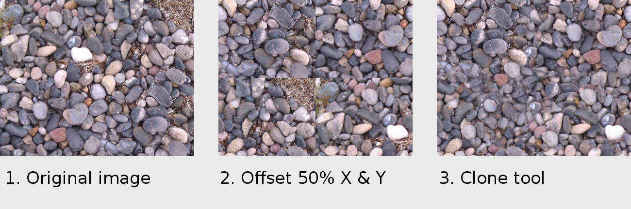
This technique is very effective for background textures. The idea is to repeat a small image over a large area. In order to avoid any obvious tiling effect you must make sure that the corners of the image blends perfectly into each other. There are several online resources for seamless textures but you can also create your own. Take a photo of a piece of cloth, a concrete wall or something else. Use the offset function in PhotoShop or Gimp to offset the image 50% on both axis. This will make the edges of the image meet in the center of the image, forming a cross. Use the clone tool to get rid of the cross. If you succeed you will have a seamless image. Resize the image to a reasonable size.
Optimize background images with media queries
For background images you can provide different image sizes for different screen resolutions or maybe even leave out the images on small devices. If you use the Mobile First approach style rules (including the large background images) for laptops and desktops will not load on handheld devices.
Using vector graphics
SVG can be used in img tags, as background images or be embedded directly in the mark-up with the SVG tag. The latter option will save you a HTTP request and allow you to edit fill and stroke colours with CSS, but embedded SVGs will of cause not make your mark up look too good. Vector Graphics can be scaled to any size without loosing detail. By now SVG is very well supported across different platforms and browsers, but is not implemented in IE8 and in older Android browsers. A quick and dirty inline bitmap fallback can be provided by using an onerror attribute:
(Setting the onerror attribute to null after setting the src is crucial. If not the error event will keep firing in case image.png can not be found)
Illustrator and InkScape can export optimized SVG images. You can also load your SVGs into a code editor and manually remove unwanted comments, attributes and white space but you must make sure that your SVG tags has a width and a height attribute with values of 100% as well as a viewbox attribute with the initial position and scale. Leaving out these attributes can cause clipping of the image in some browsers.
Lazy loading Images
Lazy loading is a technique to load images only if they are present in the users viewport. The technique is very useful if you have many images on a large page. In case the user never scrolls down the page there is really no need to load the images outside the viewport. Chris Coyier and Lorenzo Giuliani have published a script easy to implement for lazy loading of images. The idea is to use a small invisible placeholder image in the mark-up and the use JavaScript to detect if the image is in the users viewport. If so the image will be replaced with the "real" image specified in a data attribute of the image tag.