Design is not art, but has everything to do with it.
One of the most common mistakes web designers make is to trust their artistic instincts.
Design is not art, instinct or intuition. It is a craft and the main function of graphic design is not to create beautiful artistic compositions, but to make visual communication as easy to understand and interpret as possible - usually with the purpose of inducing conversions (calls to action).
Decorations and artistic elements can however add much value to a design solution, depending on the project. The "wow factor" of stunning compositions can help capture the viewers attention and provide a unique user experience. But way to often deco gets in the way, rather than support or enhance the main focus.
Function and deco
The history of design aesthetics has always contained a certain conflict between deco and functionalism. Often movements and trends dictate the amount of decoration in designs. Modern design traditions emerged from Minimalism and Rationalism advocates that form should always follow function, as opposed to Avant-garde and Postmodern influenced design movements which claims that (irrational) decoration can inspire people to use and explore a product (supposedly also digital interfaces, websites etc.). But even these movements, would have to consider the rational concepts in order to redefine or reject them.
Other than what movements and trends dictate, people also have personal preferences when it comes to decoration some people are simply "rational" and others "emotional".
How to keep focus
As mentioned before, communication and conversion are the main focus areas. So the designer must:
- Understand the identity, values, mission and vision of the sender.
- Have a clear profile of the target audience
- Figure out how to convert potential interest into the wanted response, often referred to as the "Call to Action".
A great tool for the latter is the AIDA model of communication. It breaks down the conversion into the following increments:
Attention/ Interest/ Desire/ Action
These increments can serve as sequential guidelines for graphic composition and layout
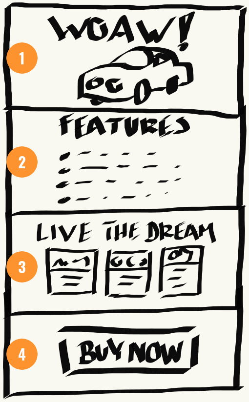
- Attention
Banner image, designed to capture the readers attention - Interest
Feautered selling points to stimulate interest - Desire
Direct apeal to the the users personal wants/needs - Action
Call to action
Typical examples of Calls to Action could be:
- Buy our product
- Contact us
- Subscribe
- Share/ like/ comment
Design concepts
Artists and graphic designers both study visual concepts. But unlike the artist, who has the freedom, to ignore all principles and conventions, the designer is forced to live by them, in order to make the product as intuitive and understandable as possible.
The design principles/patterns
These are the composition principles we use to arrange, group, separate and emphasize content. The principles includes:
- Hierarchy
- Rhythm (repetition patterns of elements)
- Balance (harmony in the layout)
- Connection (grouping / separation of content),
- Contrast (emphasizing the difference between elements)
- Movement (leading the readers eye towards important content)
The design elements
The design elements are:
- Shapes
- Lines
- Colours
- Value (light and dark)
- Proportion
- Texture
- Space (negative and positive)
The elements are simply the building blocks of the principles. Example: We can separate content with negative space or increase the contrast by inverting the value of two objects.
Sometimes you can achieve the same principle with different tools: eg. contrast can be added by using different proportions or different colours or value.
Conventions and consistency
Conventions are the common interpretations of visual elements.
These interpretations can vary depending on the cultural and social backgrounds of the target audience.
Conventions are especially important when designing user interfaces. The title of the book "Don't make me think" by Steve Krug really says it all. Users hate to waste time. If they have to learn how to use a website or an app chances are they will lose their patience and move on to something else. If you stick to conventions and keep elements consistent you are you have already provided a much better user experience than what fancy animations and stunning imagery can do.
Here is an example of a typical UI design convention:
- Red text is commonly recognized as an error message
- Yellow/orange text is commonly recognized as a warning message
- Green text is commonly recognized as an OK message.
A few uplifting words
If you have read the entire article (well done) you might be under the impression that web- and graphic- design is a analytical, rigid craft with no possibility to unleash your creativity. This is not the case at all, there is plenty of room for creative and artistic ideas. You just have to make sure that these ideas are contributing to the main function of the product.