Which one should you choose, and does it matter?
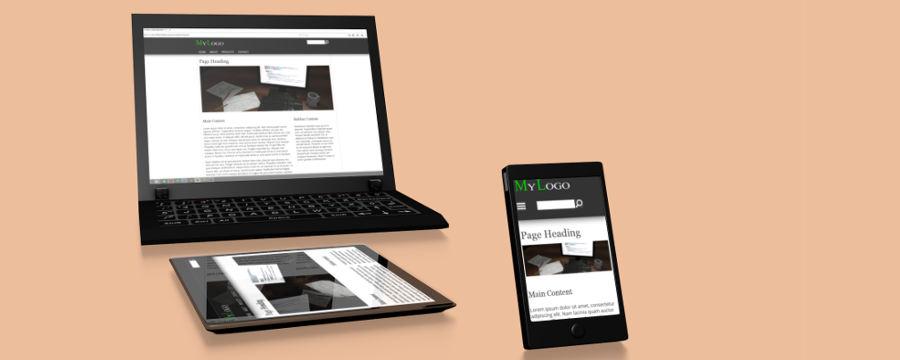
Almost all modern web pages are made using responsive/adaptive design techniques.
Responsive web design means that when a request is made for a page, the server will always deliver the same version of the page, no matter what device the request was made from. The reason that a page looks different on different devices, is that once the content is downloaded, different styles (encapsulated in different media queries) will take effect depending of the device.
Responsive web design has two main but very different approaches: Mobile first or Destop first. Both have their pros and cons, so which should you choose, and does it matter?
Let's first take a look at the ideas behind each approach.
Progressive enhancement and Graceful degradation
Mobile first is a progressive enhancement model. That means that our core product is designed to support the devices with the most limited features (in this case screen size/resolution). Our initial CSS rules are simply designed for the smallest screens possible.
After the browser have parsed these initial styles we gradually provide enhanced styles, encapsulated in min-width media queries, effectuated on larger screens.
An example of sunch enhanced styles could be to allow rows of content to float in to multiple columns
Desktop first is fundamentally different. We are structuring our CSS so the core styles (initial rules) would apply to the largest screens possible and gracefully degrade to smaller screens. The graceful degradation model is the total opposite of progressive enhancement.
It is worth to notice that mobile first design is not always equal to progressive enhancement. Many handheld devices have features that are not commonly supported on desktop computers. If you want to take advantage of location detection, gyroscopes or even touch -and rotate -events, you would actually degrade the functionality, if you were to design the application layer for desktops last.
Enough of the talk. Which technique is the best?
Ok, if you insist...
I would argue that mobile first can increase your websites performance significantly. Here are some of the reasons why:
All your initial CSS (defined outside any media queries) would be the only CSS parsed by devices with small screens. The browser can then instantly move on to rendering the page without having to parse all the CSS encapsulated in the media queries. As handheld devices often uses slow portable connections, the mobile first approach can really speed things up.
The overrides to these initial styles would be placed in min-width media queries and would only be parsed on large screen devices which often uses faster connections and have more power to process the download data.
With desktop first, the initial CSS rules are intended only for the largest screens, but are fed to all devices. Mobile phones would have to load and read through all this CSS, only to have it overridden later by max-width media queries.
The mobile first approach can also save you bandwidth and http requests for mobile users when it comes to loading of media files. Quite often web designers uses large background images on desktop layouts, only to have these images replaced or even completely removed on smaller screens. If the background images urls are referenced in the initial CSS (desktop first) the image might be loaded on all devices, no matter if it is displayed or not (depending on the browser version). However, if there is no reference to the image in the initial CSS, and only nested in media query for large screens, the mobile devices simply will not load the any images that are not display.
Take a look at these test results provided by Tim Kadlec. It gets really interesting when we get to test five. This test shows that all major browsers do not download unused background images when using the mobile first model.
Media Query & Asset Downloading Results
Here is another link to a interesting (though a bit old) article that supports my argument:
What is Mobile First CSS and Why Does It Rock?
Conclusion: So should we ever use desktop first?
The analysis above speaks for mobile first. As stated slow mobile connections and the lesser processing power on handheld devices require that you think carefully about how to optimize load times and minimize resources for such devices. However if most of your users are on desktop, and you are most comfortable with the desktop first model, it might not always be worth it to change how you do things.